

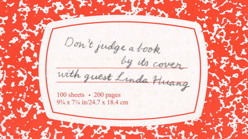
When choosing a book to read, “Don’t judge a book by its cover,” was the elementary school teacher’s mantra. Seen by the teachers as a necessary warning against the over-simplification and miscategorization of a piece of literature, it may have been more accurately quoted, “Don’t judge literature by its cover.” That is because the book, by definition, is a physical thing, one that exudes various amounts of influence on the text inside based on a great many things including paper selection, size and type choice (this is to say nothing about the book’s standalone value as an object). Out of any of its characteristics, the design of the cover may exert the most power. Some writers and publishers see this as a responsibility or an opportunity to illustrate aspects of the text. Some don’t care. And yet, no matter how we weigh the necessity or role of the design (or lack thereof) of the cover, our sense of sight — that first perception — is highly likely to be the first impression we have of a book and the work inside.
Reading literature is a slow burning and time-asking activity. Selecting a book is, oftentimes, a much faster activity. Covers catch our eyes and invite us to look a little bit closer. They can also aid the book, as it is often the text’s only “picture.” Images that initially serve only as an impetus for an experience in literature or art can become ingrained in our mind — they can color feelings and influence thought. And even more recently, with the rise of the eBook, the book cover is not a physical/protective necessity — it is simply an image — an advertisement for the book.
In the face of these thoughts and the changes wrought by our advances, I wanted to go a bit deeper into these thoughts and see what came out. To do that, I contacted my good friend Linda Huang.
******************
Linda Huang is a book designer for the Knopf Publishing Group. When I first learned of her new position at the firm, I was somewhat envious; of the many job fantasies I have, designing book covers has always been among them. The lettering of George Salter, the cloth-work on early Mark Twain novels, and Peter Mendelsund designs have, at various times, had a significant hold on my imagination. And yet, Linda, a student of the humanities, actually developed that dream and has made large strides and a great impact in one of the most influential publishing houses. Her designs can be seen at nearly any book store, and, as is more and more common, on the web. So when I had queries, thoughts and feelings that didn’t seem to quite flesh themselves out, I thought I would enlist her to get a more professional and experienced voice to weigh in. When I proposed to Linda that we do a long form interview to answer those questions, she instantly agreed. The following is our conversation.

Design: George Salter
Huck Finn's 1st edition
Adam: What is your job title? What do you do?
Linda: I'm a designer at Vintage & Anchor Books, the paperback imprint of the Knopf Publishing Group at Random House. I design book covers.
Adam: What is a book cover designer? What does the job entail?
Linda: A book cover designer is a graphic designer who distills the essence of a book to attract potential readers, or to put it simply, to advertise the book. It's a marketing tool as well as type of visual literary criticism. It doesn't involve trying to summarize the entire book — that would be impossible. Increasingly, I think it means giving the potential reader a sense of what it feels like to read the book. I think the best book covers are designed by designers who like words and enjoy reading. It entails getting to know the material — reading as much as you want or can, and making decisions about what makes sense for the cover. It’s quite a responsibility.
I think you can break it down into two parts:
1. Subject matter: Is it going to be an object? A landscape? A character? Is it more about eliciting a tone?
2. Stylistic execution: Graphic? Photographic? Illustrative? Or all-type? It involves intuiting what feels right stylistically.
Adam: Is subject matter a gut-feeling after reading the material or what does it involve? Also, as a designer with your current firm, what kind of personal freedom do you have to express those choices you make as to 1. subject matter and 2. stylistic execution? i.e. are you the one who gets to make these choices? do you ever talk with the author for additional input? is there direction from the top down?
Linda: It's a bit more hazy than just a gut-feeling. Sometimes, a distinct image will come to mind, other times, I'll jot down multiple ideas and try to execute all of them. Or I might try to explore the same idea in different ways. We are rarely told what to do specifically. But we might be shown comparative titles as a preferred direction. That doesn't stop me from exploring something that satisfies my creative impulses, something they might not be expecting but which may end up being better for the book. When these more unexpected covers get rejected I don’t see it as a loss as they provide an opportunity to grow as a designer. So yes, most of the time we get to make these choices, and I appreciate that sense of agency. We never talk with the author (unless you are friends with the author); everything goes through editorial.
Sometimes, when a book is a "priority title," we'll unfortunately get direction from sellers such as Barnes & Noble. They have the power to dictate how the cover should look. And of course we acquiesce because otherwise they won't buy as many books. Almost always, their direction is purely commercial, so what gets produced is usually a tepid, uninspired, mass treatment for the book.
There are a few editors who might already have a clear idea for the cover. Some authors, too. They might have selected a photograph or illustration or have very strong preferences for certain type treatments.
Adam: In that case, you are just the tool?
Linda: Basically, yes, just an executor. It's not a lot of fun, but you can't win every battle.
Adam: I think of the selflessness of a craftsperson doing a job for hire, versus the creative work of an artist, working to express emotions, and in some ways, I see book design as a somewhat fascinating mixture of the two. Do you see this as a balancing act? or is it truly dependent on the job?
Linda: Yes, I think it's definitely more of a balancing act for certain literary fiction, maybe even skewed more towards the “creative work of an artist,” especially for books that are high-concept or classics. Reading is inherently personal; each designer will take away something different and inject their own viewpoint. There is a certain selfishness that comes from the need to express your point of view, compared to, say, a designer of infographics. The balancing act is about making what you find special understandable on the market.
Linda's design for Seven Days in Syria
Adam: Would it be wrong for me to assume that your employer wishes you to use your creativity and that was the main reason reason they hired you?
Linda: I don't think that's wrong to assume. They also hire you for your typography skills, and above all, good taste. Being creative is a boon for certain books that call for a unique look. Other books just need to get the message across clearly. Of course, each book should be unique, but you won’t believe how many times a more unique treatment gets shot down because they don’t think it will translate to the targeted audience.
Adam: Is the main thrust of your design, "how will I make an impression? how will I draw the potential reader in?" Do you feel responsible for that aspect or is that the publisher's job?
Linda: Yeah, I ask myself those questions and I do feel responsible.
I also ask "why would I pick up this book?" and "what do I want to see on the cover of this book?" Designers have an artistic bent and the best ones try to do something different every time, which usually means their work tries to be more original instead of following a formula. Doing the same thing over and over again becomes trite and eventually that type of cover recedes.
I think that at the end of the day, most concepts and subject matters have been used, so it's a matter of how you're expressing it. But, it's very common for publishers to be risk-averse and that's the frustrating battle. You try to do something cool but unsurprisingly, they are afraid nobody is going to get it.
Adam: I mean, I get it — and I think it would be somewhat stupid to entirely trust the designers. No offense.
Linda: [laughs] I understand. Most designers here didn't go to a traditional university or a liberal arts college. . . they all went to art school except for a few, like Peter M.
Adam: But I mean, if it's either too market based or too design based, I can't imagine it's going to succeed on a level except for artistry, if the designer gets their way, or marketability, if the marketing crew gets their way.
Linda: Yup. I mean the practical point is to communicate, and if your cover is too cool or artistic, it's mostly for other designers
Adam: When designing a book, where do you start from, in a philosophical sense? do you have any mantras? rules? prohibitions? things you always have to remind yourself?
Linda: Yes. I panic all the time and feel like I never know what to do, so I have to remind myself that 1.) no matter what happens, it will get done. 2.) try not to repeat yourself. 3.) why did the author write this book? Also, what nugget can I retrieve from it to make THIS book unique? What makes THIS book different from another? I try to not do the same thing again.
Adam: I would say, judging by what I've seen, you are succeeding in not being repetitious.
Linda: I only show what I want to show on my website.
Adam: [laughs] What is the difference between art school and liberal arts school? What do you see as the advantages or aspects of either one that strike you as relative/important to book design?
Linda: Oh man do I feel strongly about this. I don't want to make generalizations about programs and their students, but I believe that at art school (getting a BFA), you're mostly being trained to think visually and make things. Perhaps only a minor part of your coursework is in the liberal arts. Getting a liberal arts degree means you're being trained to read and think in a wide variety of disciplines, which eventually becomes an advantage for book covers — if you're the type of person who enjoys designing for a wide range of subject matter (especially non-fiction).
Linda's cover for the recently published book Jazz Palace
I'm not saying that BFA grads are poor readers (you can be a good reader regardless of your training), but I think in terms of knowledge, having a liberal arts background gives you more breadth and understanding of the wider world outside graphic design, as well as a set of critical tools. And you're not afraid to tackle subject matters beyond your comfort zone.
Adam: It's a great point: that being an informed and thoughtful reader is as important or more important than being a strictly visual designer.
Linda: To a large extent. Definitely when tackling more complex books. A thoughtful reader is better able to parse through the book's contents and make thoughtful connections. But sometimes this can be a disadvantage for an inexperienced designer. You might get so stuck in the complexities and details that it becomes hard to distill everything. And a cover should be simple.
Adam: You mentioned that you and Peter are the only degree holders at your firm that come from outside of an art school...and that in some ways, this places you both somewhat outside of the design “paradigm.” What were your degrees in? What are the drawbacks of being outside? What are the advantages?
Linda: I did art and psychology, but my art degree is nothing like what you might receive at an actual art school. Maybe only one out of the four classes I took was an art class.
Peter did philosophy at Columbia and then music at Mannes (The New School). He was trained as a pianist.
The drawbacks are feeling like you're a latecomer. After my undergraduate degree, I went to Parsons for three semesters for graphic design. Three semesters...compared to eight! So you're already older, have had less training, and are in a sea of all these young, fresh design graduates who know how to design better. So it's a little discouraging at first. I think, in the long run, I don't regret it at all.
Adam: Maybe they are better executors, like you said earlier. But...you can train to be an executor.
Linda: Yeah exactly, it's just practice.
Adam: It's a little harder, in some ways, to train for holistic thinking or to train in time or life experience.
Linda: Yeah, the critical period usually occurs during college.
Adam: I just love that you and Peter are doing so well, though. I really am a strong believer in the “complete human creator” — meaning that a well-rounded person who is motivated is more interesting than a well-honed tool.
Adam: When you are at a bookstore what makes you pick up a book? What images or things make you take that first step of "individual recognition" from thousands?
Oliver Munday's design for The Silent History
Linda: Barthes talked about "punctum" — that piercing feeling you get from viewing an image. It jumps out. A lot of the time, I gravitate towards covers that are either simple and clever, or just visually fresh (usually this involves a lot of negative space). An example is Oliver Munday's (he works here) The Silent History.
If everything around the book is busy, the simplest book will jump out first. Simplicity and elegance, saying more with less, and finding a clever solution. Of course this is not an appropriate solution or approach for all books.
Adam: How about considerations of the "new" kinds of display or the new book stores i.e. web based book selling. Does any thought go into that?
Linda: eBooks
Adam: "How will this look thumbnail-size?"
Linda: Yes — generally the simpler and more iconic the cover, the better. Big, readable type. Maybe one defining graphic.
I think book covers will gravitate towards being more iconic and definitely brighter.
Adam: In regards to your thinking and aesthetics, are there any cover/book designs that were shocking for you...as in near perfection?
Linda: Shockingly perfect?
Adam: For instance, Catch 22. It is still so iconic and effective.
Linda: Oh man, there are so many good ones. I think something that's all-type like the original In Cold Blood is a good contender and Valley of the Dolls. I'm a sucker for that fat didone type.
Adam: This one?
Linda: Yeah, Evan Gaffney did that one. There's a nice feature here: http://eyeondesign.aiga.org/design-history-101-valley-of-the-dolls-book-cover-designer-on-how-he-updated-the-cult-classic/
I'm attracted to books that are predominantly type. Unfortunately we aren't able to get away with that most of the time.
Adam: Can you pick some books of yours that you like and describe why you like them? Why do they illustrate certain things you've mentioned above?
Linda: The Book of Heaven by Patricia Storace:
This was probably the first jacket I did that I actually liked. The subject matter — a re-imagining of heaven from women’s points of view with constellations concealing other heavens — lends itself to a more inventive cover. Instead of trying to simplify (which is normally the case), the complexity of the geode is what makes the cover interesting. I like the depth created by the black universe behind those triangular panels.
The Seventh Day by Yu Hua
I like how the single meandering stroke creates a strong sense of atmosphere and perspective, and I'm a sucker for calligraphic typefaces.
I Am China by Xiaolu Guo
I enjoyed delving into the visual language of punk and constructing everything by hand. There is a rawness, tension, and immediacy that cannot be created digitally.
Dust by Yvonne Adhiambo Owuor
There is nothing spectacular about this cover save that it was my first time using Photoshop to construct the art (which I'd been avoiding for far too long), so it marks a personal (albeit small) milestone. The soothing colour palette is also pleasing.
Facing the Wave by Gretel Ehrlich
This probably most embodies what I like about good non-fiction covers. It is simple, elegant, and visceral. The symbol of Japan drowning or bleeding (however you want to read it) is a perfect visual metaphor for this book.
Dept. of Speculation by Jenny Offill
The process behind this cover was pretty labourious. I think it captures the unique, poetic, fragmented style of writing, as well as visualizing the many cosmic references in the book.
Adam: Am I correct in assuming a lot of your text is done by your hand?
Linda: No, I use type most of the time!
Adam: Well shit, I’m not as sharp as I wished! An Enlarged Heart? The Liar’s Wife? My Age of Anxiety?
Linda: That's handlettering yes, but that's a minority!
Adam: Akin to the pressures of high school...I imagine finding the right font in your business is difficult. What I mean is, you feel pressured by your designer colleagues to pick a "cool" font that's not "overused" but also workable. Afterall, you work with your colleagues and rarely with the general public (who the book is actually for). I imagine your colleagues judge you more directly, for better or for worse.
Linda: That's true. It's hard to not design for other designers. It's what keeps it interesting That's often a measure of what's good (when other designers appreciate it). And, yeah, picking a typeface is fun.
Adam: Right...how many versions of comic sans do you have? That’s the real level marker!
Linda: I have two, including comic sans neue, an updated version of it [laughs]
Adam: You say you are a book cover designer. What about the spine? the back?
Linda: Those are usually afterthoughts for most books!
Adam: Even the spine?
Linda: Most of the time I'm just glad the cover's done, and I won't have to think about it for some time.
Adam: This strikes me as crazy...it's the only thing that gets seen most of the time, no?
Linda: It depends on the design. When we do the mechanical (setting up the copy for the cover on the front, back and spine), that's when we'll design the spine and it will follow the cover.
Adam: Which gets to another question: do you get to choose the size of the author’s name versus the book’s title?

*Note: Not Linda's design
Linda: I’m glad you asked because, for paperback, they will sometimes dictate this! Like, for this book the author's name is most important...the author is the selling point.
Adam: Right, I thought so. "From bestselling author DEAN KOONTZ...The Lair (maybe a title of his, probably not).
Linda: Yes! exactly. Marketing tactics! Sometimes if I set the author and title as the same size, my art director will ask if the author is that important. So, for paperback, it's definitely more strategic; for hardcover, it is more aesthetic, but it ultimately depends on the author, right?
Adam Do you think of the book’s life after the sale? Or what your relationship or your design's relationship with the readers?
Linda: I generally don’t think much about my covers after they’re printed. Usually the time between designing a cover and when the book is finally on sale is anywhere between 8-12 months. That doesn’t mean it’s not nice to stumble into a bookstore and spot your covers. Still, it is a strange feeling. Whether or not I like my design, my heart does a little flutter. It’s like spotting your babies out in the wild — you have intimate knowledge about each of them and you wonder who is going to wander by and be intrigued enough to pick them up, and you imagine the subsequent life they will have together, the reader and the cover. On social media, it's fun to see others posting my book covers for some of the more popular books. The cover becomes the only piece of advertisement.
Adam: How does your environment influence your design or thinking?
Linda: There's the immediate environment of your workplace, and the greater environment of New York City. If I’m surrounded by talented, thoughtful, and hardworking designers who are at the top of their field, I will inevitably absorb some of that positive energy. What I see coming out of the printer every now and then is itself a huge learning experience. The books and authors we get to work on are also considered some of the best in the English language, which doesn’t hurt! It’s very motivating.
In terms of physical workspace, I never thought I’d say this but I actually enjoy having a cubicle and benefiting from even the illusion of privacy. I recall describing my ideal work environment to someone before I got this job: that I would be happy just sitting at a desk, in my own world, solving design problems. That is a pretty accurate description of what I do.
Living in New York is also wonderfully stimulating. In addition to the designated zones for art in museums and galleries, the vernacular designs — from supermarket posters to takeout menus — are a rich source of inspiration that can sometimes work their way into covers. There is a lot to be noticed in the city.
Adam: How does your work as a designer/book designer influence your life? How does it change the way you look at things?
Linda: As a book cover designer I am more understanding of design choices behind the marketing of a certain book. I can see when a final design was more driven by sales, for example. I judge books by their covers because that is my job, but at the same time, I know when to not.
In terms of being a plain designer, I am very sensitive to typography in my environment, particularly the poor kerning and spacing on those horizontal subway ads. I find myself mentally adjusting the type and questioning the successfulness of an ad campaign. I am a more critical looker but have also become more easily amused by mundane street sightings and juxtapositions, for example, the inadvertent arrangement of objects that might resemble a face, or something else surreal.
My boyfriend is also a graphic designer. Living with him for the past three years has probably been the single biggest influence in the way I see things as a designer. We’re trying to live with more intention — making deliberate choices about the way we spend our resources to create the kind of lifestyle we want. This means more than appreciating nice furniture. It’s about how we can generate more richness in life and extract more meaning with everything we do. I’m making it sound more vague and lofty than it is. It’s an ongoing, active process of refining one’s tastes and choices to reflect one’s personal goals. It’s too easy to let life happen to you, and to be pulled into many directions at once and not question what you want. I struggle with this.
Adam: Are there any other questions you want me to ask?
Linda: Are there cases where reading the book does not help with the cover?
Yes. In certain cases, after having read and represented the book to an author's liking, bookstore buyers will ask for a cover that is completely incongruent with the book because they think it will sell (notably women's and summer fiction!). You are left wondering whether they understand the book at all, or how they feel about deliberately misrepresenting the content. I am not saying that selling the book isn't important; I am saying that we should give more credit to readers and not constantly cater to the lowest common denominator.
